16th May 2024
What’s New in vDesigner 2.0?
Note: To reflect the new changes please trigger the new Build and update the themes and styles module.
Fractional Data Display in Radial Progress Bar Element
In vDesigner2.0, we have introduced an enhanced feature that allows users to display fractional data within the radial progress bar element. Previously, users were limited to showcasing data solely in percentage format. With this update, users now have the flexibility to toggle between percentage and fractional representations of their data.
Key Features:
- “Fractional” Checkbox: 1. A new checkbox labeled “Fractional” has been added to the property panel under the basic section of the radial progress bar element.
- When the “Fractional” checkbox is selected, users can enable the fractional mode, allowing for the display of values in fractions. By default, this checkbox remains unchecked, preserving compatibility with existing designs and ensuring that values are initially shown in percentage format.
Limitations: After the selection of the “Fractional” checkbox, fractional values will be exclusively visible to users in the preview and build. On the canvas, values will continue to be displayed solely in percentage format. Rest assured, this issue will be resolved in an upcoming release.

Fig1: This figure represents the “Fractional Checkbox” property of the radial progress bar element.
Introducing Description field while creating the Task Group
In vDesigner2.0, we have added a description field during the creation of a new task group. With this enhancement, users now have the capability to include a description for each task group they create, providing valuable context and information.
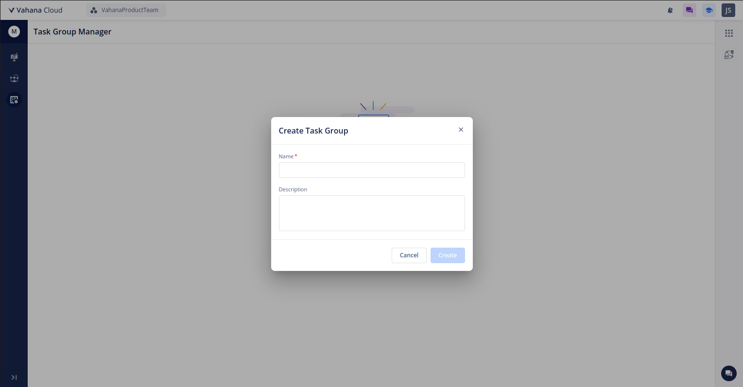
Fig 2: This figure represents the description field while creating a new task group.
Numbers To Word Function
In vDesigner2.0, we have introduced two functions in the smart selector, which user can use to convert numbers into words. The two functions are as follows:
- NUMTOWORDSEN(): User can use this function to convert numbers upto Trillion 10^12 beyond that value function should include multiplier.
For Example: input value = 20000000000, output → Two trillion.
- NUMTOWORDSIn(): User can use this function to convert numbers upto crores 10^7 beyond that value function should include multiplier.
For Example: input value = 19,1700,00,00,000, output = nineteen thousand, seven hundred crores.

Fig 3: represents the “NUMTOWORDSEN()” and “NUMTOWORDSIN()” functions under the smart selector.
Bottom Sheet with Overlay
In vDesigner2.0, we have introduced a feature allowing users to convert pages into bottom sheets. This feature enhances the flexibility and usability of the application, providing users with more options for page layout and design.
Key Features:
- Enhanced Page Layout Flexibility: Users can now transform pages into bottom sheets, providing greater flexibility in organizing and presenting content within the application.
- Overlay Functionality for Enhanced User Experience: With the overlay option, users can overlay additional content or information on top of the bottom sheet, enriching the user experience and enabling more dynamic interactions.
- Customizable Bottom Sheet: The bottom sheet conversion option allows for easy customization of page properties such as Initial Height, Max Height, MIn Height, elements positioning through CIA,etc and empowering users to tailor the layout to their specific use cases.

Fig 4: This figure represents the Bottom Sheet.
Open Date Picker Tak
In vDesigner2.0, we have introduced a new task called “open date picker”. The Open Date Picker Task enables users to trigger the display of a date picker element by interacting with other elements within vDesigner2.0. This functionality enhances user flexibility and interaction within the application.
Properties:
- Templates: Templates are predefined configurations or layouts for the date picker element. Users can select between 2 templates i.e. (Template1 and Template 2) to customize the appearance and functionality of the date picker.
- Input start date: Specifies the start date input parameters required to trigger the opening of the date picker. So, users should have the two options i.e. static and dynamic. Dynamic option will include smart selector which has date, static functions, entities and elements through which the user can trigger the date picker element.
- Input end date: Specifies the end date input parameters required to trigger the opening of the date picker. So, users should have the two options i.e. static and dynamic. Dynamic option will include smart selector which has date, static functions, entities and elements through which the user can trigger the date picker element.
- Read Format: Defines the format in which the date picker element reads data or information. This ensures consistency and compatibility with other elements or systems within vDesigner2.0. Available formats to use as follows: dd/MM/yyyy, yyyy/MM/dd, MM/yyyy/dd, MM/yyyy, dd/MM, yyyy, MMM, MM.
- Write Format: Specifies the format in which the date picker element writes or stores data.Available formats to use as follows: dd/MM/yyyy, yyyy/MM/dd, MM/yyyy/dd, MM/yyyy, dd/MM, yyyy, MMM, MM.
- Input Location: Describes to fetch date dynamically such as elements or entities, to open date picker tasks. This will include a smart selector which has static functions, entities and elements.
- Output Location: Describes the output or result of the open date picker task. This will include a smart selector which has static functions, entities and elements.

Fig 5: This figure represents the Open Date Picker Task.
Introducing Shadow Properties and Border Weight customisation in layouts and elements
in vDesigner 2.0, we have introduced shadow properties and border customization options within layouts and elements. These additions significantly enhance the UI/UX customization capabilities for both layouts and individual elements.
Key Features:
-
Shadow Properties: Shadow properties have been incorporated into the following elements: “Row,” “Column,” “Stack,” “Card,” and “Button.” This addition allows users to apply shadows to these elements, enhancing the visual appeal and depth of their designs.
-
Border Customization: A border weight property has been introduced specifically for the “Button” element. This property enables users to adjust the thickness or thinness of the border surrounding the button.
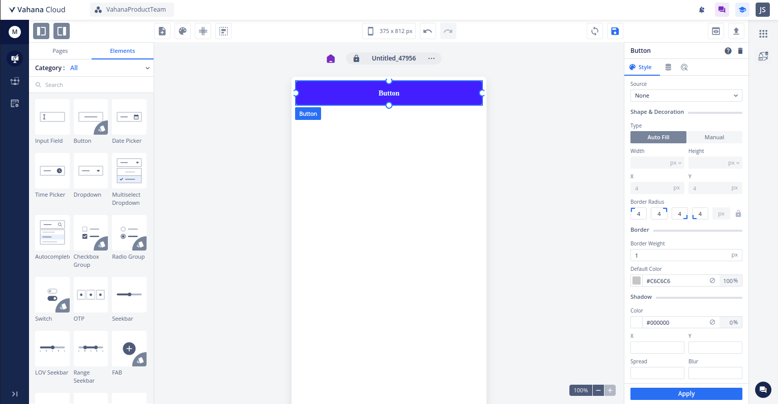
Fig 6 : This figure represents the shadow and border properties.
Introducing Invoke Tooltip task and show tooltip as a property in the elements
In vDesigner 2.0, we have introduced the “Invoke Tooltip task” and the addition of a “Show Tooltip” checkbox property in various elements. These enhancements provide users with more control over tooltip display and interaction within their designs.
Key Features:
- Invoke Tooltip Task:
The Invoke Tooltip task has been introduced to enable users to trigger the display of tooltips within their designs. Users can define their message in the message field of the task, and the task will have the higher priority over the message declared in the property panel.
- Show Tooltip Property:
A “Show Tooltip” checkbox property has been added to the property panel for the following elements: “Input Field”, “Date Picker”, “Time Picker”, “Dropdown” “Multiselect Dropdown”, “Autocomplete Dropdown”, “Check box”, “Radio Button”, “Switch”, “OTP”, “Seekbar”, “LOV Seekbar”, “Range Seekbar”, “Linear Progress Bar”, “Radial Progress Bar”, “Textarea”, “Button Group”, “Icon”, “Image”, “Star Rating”. Once the checkbox is selected, users can dynamically or statically declare the tooltip message through a smart selector. Additionally, users can customize the color of the tooltip icon.
- Note: 1. To display the tooltip message, users need to mark the “Show Tooltip” checkbox from the property panel while configuring it.
- For icon and image element users can only trigger the tooltip messaging through invoke tooltip task.
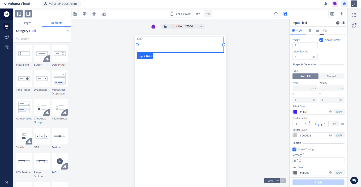
Fig 7: This figure represents the Show Tooltip under the element’s property panel .

Fig 8: This figure represents the Tooltip task .
Introducing handling of Query Parameters in web view task
In vDesigner 2.0, we have enhanced web view element and open web view task to efficiently handle deep linking and query parameters from external applications, ensuring task execution based on provided parameters.
Note:
- User can not open the application which belongs to the same environment.
- This functionality is only working on the web build.
- If the user fall back again on the application then new tab will be opened, So user is required to use the save data task to skip the data loss.
Rich Text Editor(Beta Version)
In vDesigner 2.0, we have introduced a rich text editor (Beta version),offering users enhanced text editing functionalities.
Limitations: 1. Currently the font family is not supported in the rich text editor.
-
Circle, square bullet points are not working on the web build.
-
Scroll bar is not present inside the rich text editor.
Bug Fixes
Designer 2.0
UI Fixes
- Resolved UI issue of Redo/Undo icon which gets overlap on designer when user clicks on 9 dots
- Fixed the UI issue on Display Message Reference name for the elements.
Data Modeler
- Fixed the Data visibility issue when the data model is attached with the application.
Design System
- Resolved the support portal navigation issue under the themes and styles module.
- Resolved the icon color fluctuation after applying the theme.
Elements and Page
-
Max Length and Min Length properties added to the input field property panel for number input type.
-
Fixed the random inputs inside the date picker element.’
-
Fixed Obj function inside the contains function.
-
Fixed the ITSM app sec issues
-
Fixed the upload media task on the web build
-
Fixed the Regex failure messages on the builds
-
Fixed the visibility issue of mapping same entity path on the elements
-
Fixed the issue, ensuring that the background color now correctly receives the color code at 0 percent without requiring manual adjustment from 1 to 100 percent.
-
Resolved an issue, where the cursor was not moving automatically to the next input field, which should occur seamlessly.
-
Resolved an issue, where the property panel was resetting to the initial position after every apply operation, causing inconvenience during application design.
-
Resolved an issue to maintain the scroll position of the property panel for the same element.
-
Removed the style section under the pop page
-
Fixed the issue of dragging indicators inside the pop up page.
-
Resolved an issue where the state of switch buttons and checkboxes/radio buttons was not retained upon back press, contrary to user selection. Additionally, the state should be cleared upon forward press.
-
Fixed the button element border properties.
-
Corrected the message field spelling in the BR widget.
-
Removed the set login page visibility icon on the page if, page is already a home page
-
Restrict the card dragging functionality inside the layouts
Tasks
- Resolved the alert issue in the task group.
- Correct the snack bar messaging in side the configure service task.
Canvas
- Resolved the canvas 404 error
- Made the validate elements field mandatory under the data validation task.
- Enhanced the search filter by removing the spaces if entered inside the search field.