Introducing Web-First, Responsive Design in Designer 2.0
Designer 2.0 empowers teams to build modern, responsive, and truly cross-platform applications using a single design system.
Applications created with Designer 2.0 can be seamlessly deployed across:
-
Web - optimized for mobile, tablet, and desktop form factors
-
Android
-
iOS
This marks a significant evolution from vFlow, which was limited to web-only application development. With Designer 2.0, teams can embrace a web-first yet platform-agnostic approach, delivering consistent experiences across all devices without duplication of effort.
 What’s New in This Release
-
Web First PWA support for Flutter Web, enabling web-optimized, responsive design within Designer 2.0.
-
Advanced layout capabilities with Grid and Wrap elements to create flexible, adaptive layouts based on available width.
-
Granular responsive design controls, allowing visibility and behavior to be tailored for mobile, tablet, and web.
-
Dynamic size validations that automatically adapt to the canvas dimensions.
-
Enhanced canvas interaction, with smooth scrolling directly within the canvas for improved usability.
-
Web First page preview, providing accurate validation of responsive web layouts.
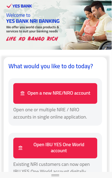
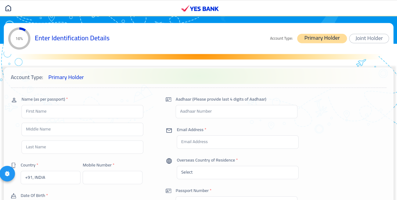
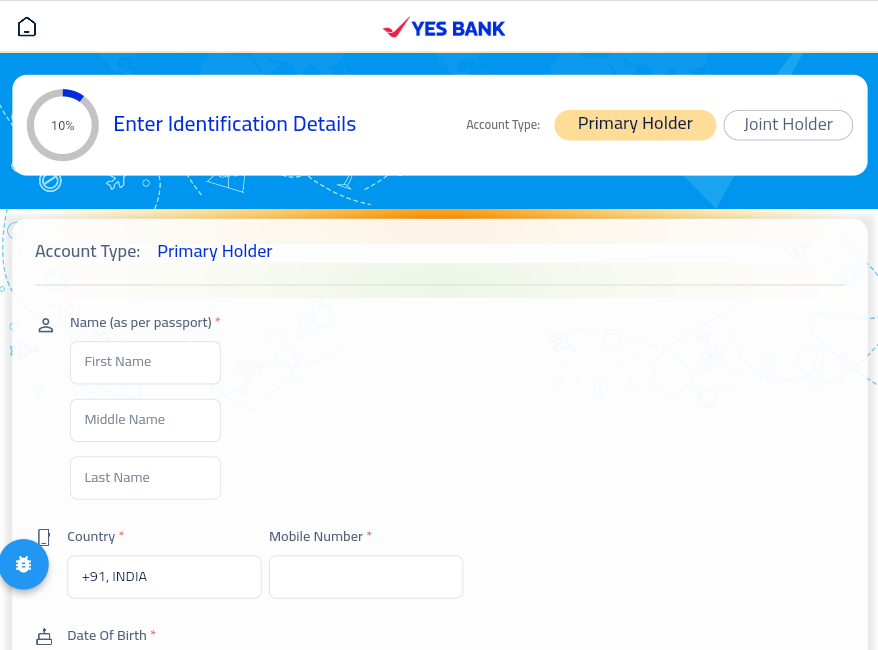
 Customer Success Story: YBL NRI App
The YBL NRI app showcases the real-world impact of Designer 2.0’s responsive and cross-platform design capabilities.
Using Designer 2.0, the YBL team successfully:
-
Built a single responsive application usable across Android, iOS, and Web
-
Delivered a consistent user experience across mobile, tablet, and desktop devices
-
Leveraged web-first layouts to handle complex screens with ease
-
Reduced development effort while accelerating delivery timelines
This success story highlights how Designer 2.0 enables teams to move beyond web-only solutions and confidently design applications that scale across platforms and devices.
HOME