Hi,
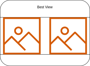
I have been trying to create a card with layout for e.g.

But, I am having difficulty in showing a Image element in Card component.
I have tried placing URL of my image in Default Value and also in Mock Object.
Still not able to show any image.
What is the step by step way to show banner image on card?
@tushar.jain @vipin.verma If you could please help in achieving this?
2 Likes
There is no such way of doing this as of now.
2 Likes
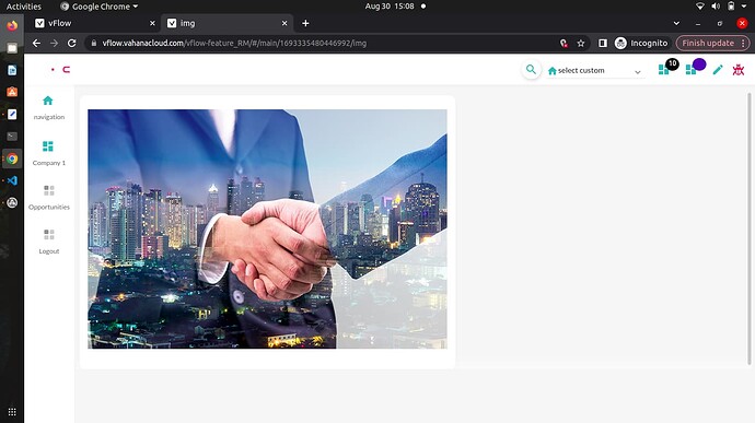
Card Component or FV Component consisting of an Image Element can be used to show an image as a banner.
Steps to configure the requirement:
- Add a FV/Card component and enter the basic details.
- For Card Component, select Template 4 and for FV Component, select Template 3 or Template 4 in the UI Properties of the component.
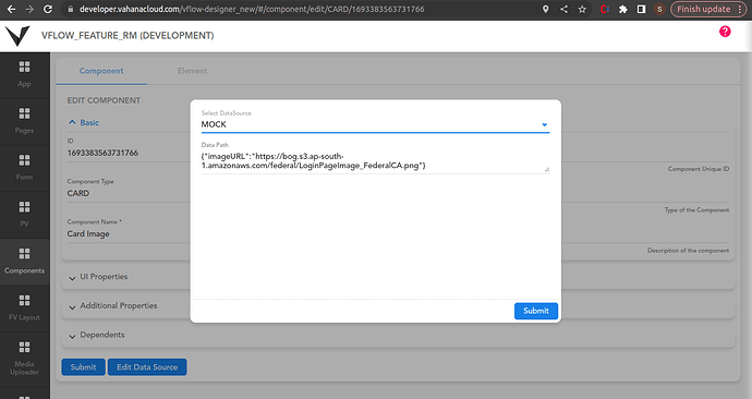
- Click on Add Datasource button, a popup will open where you can add a datasource containing the image URL. Datasource can be of MOCK/OBJECT type. (Refer below image for the datasource)
Note: To show a list of images by a single component, use FV component having the datasource in array of object format.
3. Submit the FV/Card Component and navigate to the Elements Tab.
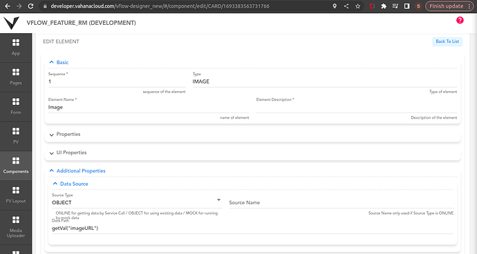
4. Add an Image Element, enter basic details and mention the data path in the additional properties according to the Component datasource key.
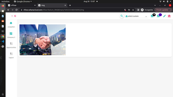
Output as per Card Component:
Output as per FV Component:
UI Properties can be applied on the component as per the requirement. Also, Custom CSS can be used to remove the card background, margin etc.
22 Likes
Hi @ShraddhaDhoke ,
Thanks for detail reply. This template is completely different than what I am asking in question. Is there any way of creating a card in wireframe?
Also, why can’t we have a row column layout for card itself like a page. In that way, we can add any element into it.
Please suggest
3 Likes
@DebugHorror There is no layout structure for the Components entity in vFlow currently.
To add multiple elements in a card, you can use FV component (Template 3 or 4) to design a card with different elements. Different elements can be added and designed by configuring the Laptop/Desktop Width, Tab Width, Mobile Width in the UI Properties of the elements.
Also, Group Element can be used to group the elements in the FV component which may solve the purpose of row column layout structure to some extend.
Refer below image for design using Group Element
Here, 1st element is an Image element and all the other elements are grouped in the 2nd element which is a Group Element. The width is managed by Laptop/Desktop Width for each element.
21 Likes
