There is an option in Fieldset of Progress Bar…how can we configure it ?
45 Likes
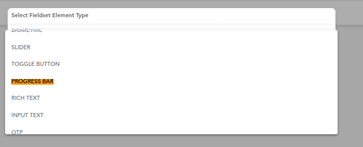
To configure PROGRESS BAR Element,
- Add Progress bar element in Fieldset/ FV component
- Add Datapath in additional properties to set progress value or add Default Value.
- In the properties section, select the desired mode.
These are the required properties which are must to configure a PROGRESS BAR element.
44 Likes
Examples of different Modes in Progress Bar element
Determinate: Shows progress with static value
Indeterminate: The progress bar moves left to right
Buffer: Shows a buffer value. In the image below, Buffer value is 50 and Progress value is 25

Query: The progress bar moves right to left

44 Likes
Will it show the buffer percent on howering?
6 Likes
No, buffer value is not shown on hovering.
40 Likes
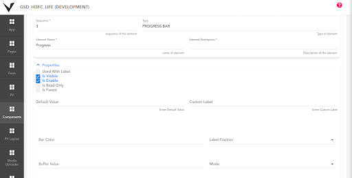
@Shrdha Can you please elaborate about the different properties present in progress bar-
44 Likes
@ShraddhaDhoke, Can we have round shape progress bar?
7 Likes
Some more properties in the Progress bar element:
Buffer: Buffer value is used to show the additional buffering progress
Bar Color: Any color can be added here to set on the progress bar
Used With Label: Shows the Element Name as the label
Label Position: Used to set the Label position (Top, Bottom, Left, Right)
42 Likes
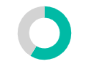
@Shubhamkumar1 By Progress Bar element we can create a horizontal progress bar. There is no option to create a circular progress bar by this element.
As a workaround, you can use Chart component to show similar functionality.
43 Likes
Thanks @ShraddhaDhoke .
4 Likes
Nice explanation @ShraddhaDhoke.
4 Likes