There is specific format for the charts, refer the below documentation.
Component : Flutter
New Releases :
- Bar Chart Component
- Pie Chart Component
- Line Chart Component
- Scatter Chart Component
Common Configuration :
Data Configuration
- X-Axis Data Array : takes an array path for X- Axis values.
eg. $.BAR_CHART.XAXIS = [“Mon”,”Tue”,”Wen”,”Thu”,”Fri”,”Sat”]
- Y-Axis Data Array : takes an array path for Y- Axis values.
eg. $.BAR_CHART.Y_AXIS = [10,20,30,40,50]
- Indicator Data Array : Takes path for array of objects where each object contains
selected state key & name key.
eg. $.PIE_CHART.SERIES[*] = [{
“NAME”: “Mon”,
“VALUE” : 30,
“IS_SELECTED” : true
},{
“NAME”: “Tue”,
“VALUE” : 40,
“IS_SELECTED” : true
}];
You can pass a series array path, if you structure json in the same way like the above example.
Note :
(i) If your chart alignment is “Vertical” then you don’t need to provide a Y Axis data path.
(ii) If your chart alignment is “Horizontal” then you don’t need to provide an X- Axis data path.
4.Series Data Array : Series data array path.
eg. $.PIE_CHART.SERIES[*] = [{
“NAME”: “Mon”,
“VALUE” : 30,
“IS_SELECTED” : true
},{
“NAME”: “Tue”,
“VALUE” : 40,
“IS_SELECTED” : true
}];
- Scatter Series Data Array : Series data array path for scatter chart.
eg. $.PIE_CHART.SERIES = [[2,4],[3,8],[1,9],[6,4],[2,4]];
- Series Name Key : Series name key which you want to map with your provided data,
As we can see in the above example, the key is “Name”.
- Series Value Key : Series value key which you want to map with your provided data,
As we can see in the above example key is “VALUE”.
- Indicator Key: Only required if you want to show an indicator in your chart.
As we can see in the above example key is “IS_SELECTED”, only
boolean value is accepted.
Choice Configurations :
-
Show Title Subtitle : Select Yes, if you want to show title & subtitle in the chart.
-
Show X-Axis : Select Yes, if you want to show X-Axis Data.
-
Show Y-Axis : Select Yes, if you want to show Y Axis Data.
-
Show Indicator : Select Yes, if you want to show an indicator in the chart.
-
Show Tooltip : Select Yes, if you want to show tooltip in the chart.
-
Show Split Line : Select Yes, If you want to show Axis lines in the chart.
-
Indicator Scroll: Select Yes, if you want to make indicators scrollable.
-
Show Series Label : Select Yes, if you want to show a label on Series data.
-
Curved Line : Select Yes, if you want a line in the line chart smooth.
-
Show Series Label Line: Select Yes, if you want to show a line on each series label.
-
Show Series Background : Select yes , if you want to show background color for
series(mostly for bar chart)
Properties Configuration:
-
Title : Primary title for chart
-
Subtitle : Secondary title for chart.
-
Title Color : hex color or rgb function for title.
-
Subtitle Color : hex color or rgb function for subtitle.
5.Title Size : size for title text.
6 Subtitle Size : size for title subtitle text.
-
Text Margin : margin of text.
-
Text Horizontal Alignment: Horizontal alignment of text, supported values are
left,center ,right.
- Text Vertical alignment: Vertical alignment of text, supported values are
top ,middle ,bottom.
-
Direction : Direction for chart, supported values are horizontal or vertical.
-
Background color : hex color or rgb for chart background.
-
Series Fill color: hex color or rgb for chart series, it can takes multiple value separated
by comman. Eg . #FFFFFF or #FFFFFF,#00FF00, #FF00FF
-
Series Background color: hex color or rgb for series background.
-
Pie Radius : radius for pie chart.
-
Indicator Alignment : Alignment for indicator, supported values are left, right.
-
X-Axis Alignment: X Axis data alignment, supported values are top,bottom.
-
Y-Axis Alignment : Y Axis data alignment, supported values are top,bottom.
-
X-Axis Text : Text for X-Axis
19 X-Axis Text Font Size : Font size for X- Axis text.
-
X-Axis Text Font color: hex color or rgb for X-Axis text.
-
X-Axis Data Font color: hex color or rgb for x-Axis data tiles.
-
X-Axis Data Font Size: size for x Axis data tiles
-
Y-Axis Text : Text for Y-Axis
24 Y-Axis Text Font Size : Font size for Y- Axis text.
-
Y-Axis Text Font color: hex color or rgb for Y-Axis text.
-
Y-Axis Data Font color: hex color or rgb for Y-Axis data tiles.
-
Y-Axis Data Font Size: font size for Y-Axis data tiles.
-
X-Axis Data Rotational Angle: Rotational angle for X-Axis data tiles. eg. 30 or 90.
-
X-Axis Text Rotational Angle: Rotational angle for X-Axis text. eg. 30 or 90.
-
Y-Axis Data Rotational Angle: Rotational angle for Y-Axis data tiles. eg. 30 or 90.
31: Y-Axis Text Rotational Angle: Rotational angle for Y-Axis text. eg. 30 or 90.
32.Tooltip Formatter: The template variables are {a}, {b}, {c}, {d} and {e}, which stands for
series name, data name and data value. eg. ‘{b}: {c}
{b}: {c}’
‘a’ for data series name , ‘b’ for data name, ‘c’ for data value and ‘d; for
none.
- Scatter Symbol : Scatter series symbol for scatter chart, supported symbols are circle,
arrow ,rect, roundRect , triangle, diamond, pin, arrow’, none.
Note : As you can see there are a lot of properties in chart components but they are only for customisation purposes, only data configurations & direction are mandatory for charts.
- Bar Chart Component :
A bar chart is a chart that presents categorical data with rectangular bars. The bars can be plotted vertically or horizontally.
Sample 1:
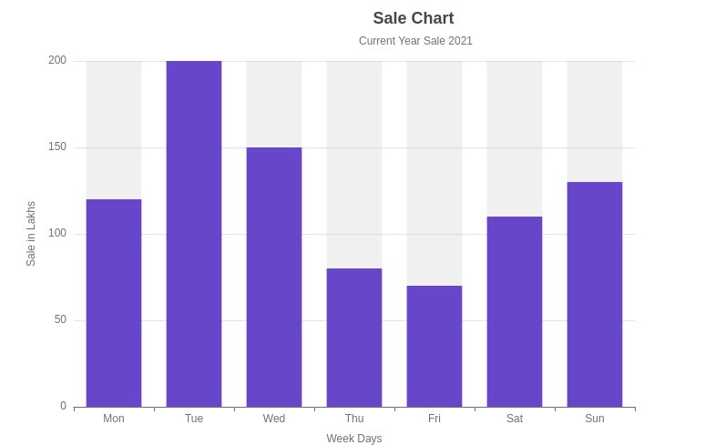
Structure for Series Data :
$.CHART.BAR_CHART[*] = [{
“name” : “Sales Bar”,
“value” : [10,20,30,40,90],
“is_selected” : true
}]
- Pie Chart Component :
A pie chart is a circular statistical graphic, which is divided into slices to illustrate numerical proportion. In a pie chart, the arc length of each slice (and consequently its central angle and area), is proportional to the quantity it represents.
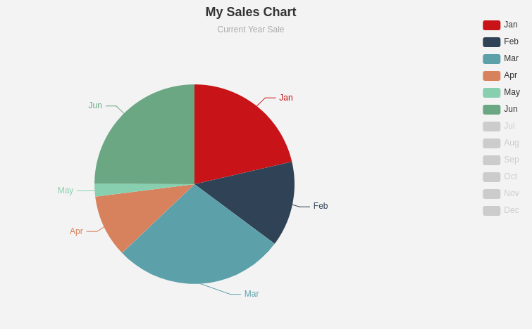
Structure for Series Data :
Field for path : Series data Array
$.CHART.PIE_CHART[*]= [{
“name” : “Jan”,
“value” : 50,
“is_selected” : true
},
{
“name” : “Feb”,
“value” : 40,
“is_selected” : true
},
{
“name” : “Mar”,
“value” : 10,
“is_selected” : true
}]
- Line Chart Component :
A line chart is a type of chart which displays information as a series of data points called
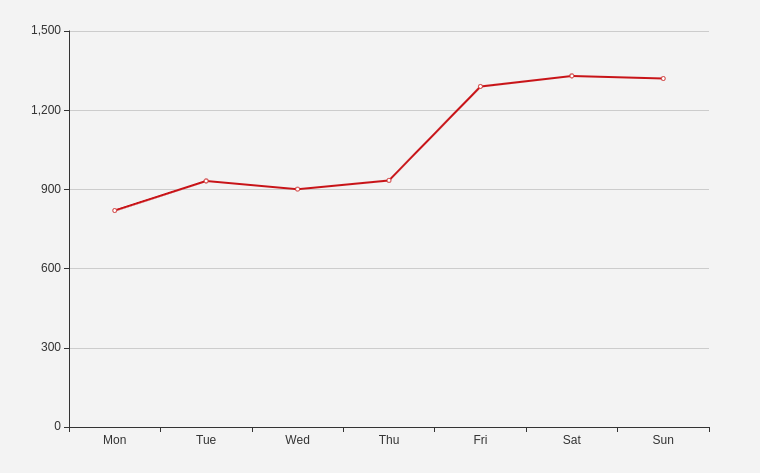
‘markers’ connected by straight line segments.
Structure for Series Data :
Field for path : Series data Array
$.CHART.LINE_CHART[*] = [{
“name” : “line_1”,
“value” : [700,900,910,1300,1400,1370],
“is_selected” : true
}]
- Scatter Chart Component :
A scatter plot is a type of plot or mathematical diagram using Cartesian coordinates to display values for typically two variables for a set of data.
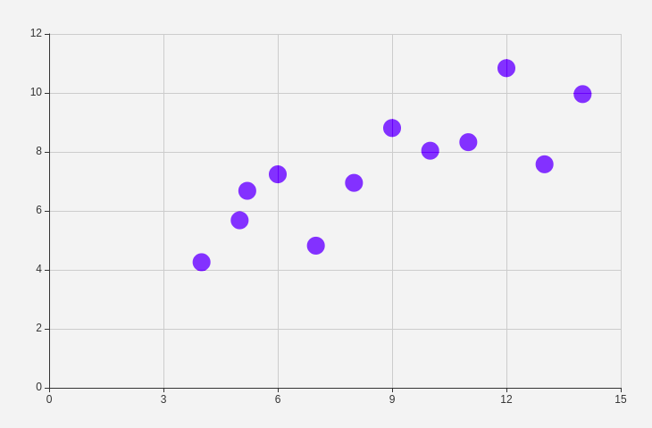
Structure for Series Data :
Field for path : Scatter Series data Array
$.CHART.SCATTER_CHART_DATA = [[2,4],[3,8],[1,9],[6,4],[2,4]].
Thank You