We have a specific client requirement wherein whenever a specific user roles login in the application, they should see a separate dashboard with dynamic graphs/charts in the Vahana 1.0 vDesigner mobile app.
Is it possible to have a separate lading screen with graphs/charts based on user login?
2 Likes
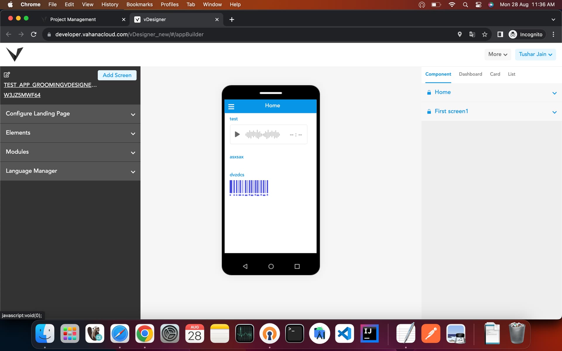
@VivekBhardwaj : In vDeisgner you cannot make much changes in default landing screen but there is an option to make any page as your landing page. You can create your own dashboard page by using a normal page and then by going in the application setting as shown in the below screenshot:
After that you need to change property of dashboard type to Custom and enter the form id in next field.
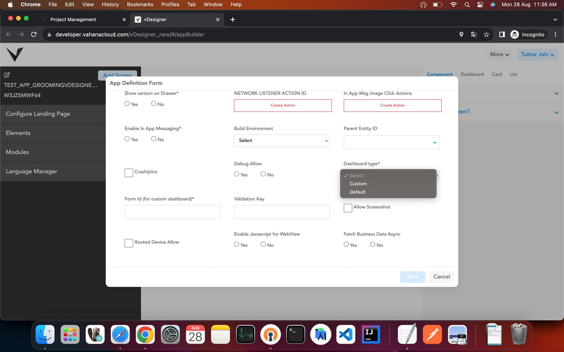
After that your page will be used as dashboard or default landing page.
2 Likes
@tushar.jain Thanks for the details
But, is it possible to show dynamic charts/graphs based on response from DBES API on that landing screen?
2 Likes
There is specific format for the charts, refer the below documentation.
Component : Flutter
New Releases :
- Bar Chart Component
- Pie Chart Component
- Line Chart Component
- Scatter Chart Component
Common Configuration :
Data Configuration
- X-Axis Data Array : takes an array path for X- Axis values.
eg. $.BAR_CHART.XAXIS = [“Mon”,”Tue”,”Wen”,”Thu”,”Fri”,”Sat”]
- Y-Axis Data Array : takes an array path for Y- Axis values.
eg. $.BAR_CHART.Y_AXIS = [10,20,30,40,50]
- Indicator Data Array : Takes path for array of objects where each object contains
selected state key & name key.
eg. $.PIE_CHART.SERIES[*] = [{
“NAME”: “Mon”,
“VALUE” : 30,
“IS_SELECTED” : true
},{
“NAME”: “Tue”,
“VALUE” : 40,
“IS_SELECTED” : true
}];
You can pass a series array path, if you structure json in the same way like the above example.
Note :
(i) If your chart alignment is “Vertical” then you don’t need to provide a Y Axis data path.
(ii) If your chart alignment is “Horizontal” then you don’t need to provide an X- Axis data path.
4.Series Data Array : Series data array path.
eg. $.PIE_CHART.SERIES[*] = [{
“NAME”: “Mon”,
“VALUE” : 30,
“IS_SELECTED” : true
},{
“NAME”: “Tue”,
“VALUE” : 40,
“IS_SELECTED” : true
}];
- Scatter Series Data Array : Series data array path for scatter chart.
eg. $.PIE_CHART.SERIES = [[2,4],[3,8],[1,9],[6,4],[2,4]];
- Series Name Key : Series name key which you want to map with your provided data,
As we can see in the above example, the key is “Name”.
- Series Value Key : Series value key which you want to map with your provided data,
As we can see in the above example key is “VALUE”.
- Indicator Key: Only required if you want to show an indicator in your chart.
As we can see in the above example key is “IS_SELECTED”, only
boolean value is accepted.
Choice Configurations :
-
Show Title Subtitle : Select Yes, if you want to show title & subtitle in the chart.
-
Show X-Axis : Select Yes, if you want to show X-Axis Data.
-
Show Y-Axis : Select Yes, if you want to show Y Axis Data.
-
Show Indicator : Select Yes, if you want to show an indicator in the chart.
-
Show Tooltip : Select Yes, if you want to show tooltip in the chart.
-
Show Split Line : Select Yes, If you want to show Axis lines in the chart.
-
Indicator Scroll: Select Yes, if you want to make indicators scrollable.
-
Show Series Label : Select Yes, if you want to show a label on Series data.
-
Curved Line : Select Yes, if you want a line in the line chart smooth.
-
Show Series Label Line: Select Yes, if you want to show a line on each series label.
-
Show Series Background : Select yes , if you want to show background color for
series(mostly for bar chart)
Properties Configuration:
-
Title : Primary title for chart
-
Subtitle : Secondary title for chart.
-
Title Color : hex color or rgb function for title.
-
Subtitle Color : hex color or rgb function for subtitle.
5.Title Size : size for title text.
6 Subtitle Size : size for title subtitle text.
-
Text Margin : margin of text.
-
Text Horizontal Alignment: Horizontal alignment of text, supported values are
left,center ,right.
- Text Vertical alignment: Vertical alignment of text, supported values are
top ,middle ,bottom.
-
Direction : Direction for chart, supported values are horizontal or vertical.
-
Background color : hex color or rgb for chart background.
-
Series Fill color: hex color or rgb for chart series, it can takes multiple value separated
by comman. Eg . #FFFFFF or #FFFFFF,#00FF00, #FF00FF
-
Series Background color: hex color or rgb for series background.
-
Pie Radius : radius for pie chart.
-
Indicator Alignment : Alignment for indicator, supported values are left, right.
-
X-Axis Alignment: X Axis data alignment, supported values are top,bottom.
-
Y-Axis Alignment : Y Axis data alignment, supported values are top,bottom.
-
X-Axis Text : Text for X-Axis
19 X-Axis Text Font Size : Font size for X- Axis text.
-
X-Axis Text Font color: hex color or rgb for X-Axis text.
-
X-Axis Data Font color: hex color or rgb for x-Axis data tiles.
-
X-Axis Data Font Size: size for x Axis data tiles
-
Y-Axis Text : Text for Y-Axis
24 Y-Axis Text Font Size : Font size for Y- Axis text.
-
Y-Axis Text Font color: hex color or rgb for Y-Axis text.
-
Y-Axis Data Font color: hex color or rgb for Y-Axis data tiles.
-
Y-Axis Data Font Size: font size for Y-Axis data tiles.
-
X-Axis Data Rotational Angle: Rotational angle for X-Axis data tiles. eg. 30 or 90.
-
X-Axis Text Rotational Angle: Rotational angle for X-Axis text. eg. 30 or 90.
-
Y-Axis Data Rotational Angle: Rotational angle for Y-Axis data tiles. eg. 30 or 90.
31: Y-Axis Text Rotational Angle: Rotational angle for Y-Axis text. eg. 30 or 90.
32.Tooltip Formatter: The template variables are {a}, {b}, {c}, {d} and {e}, which stands for
series name, data name and data value. eg. ‘{b}: {c}
{b}: {c}’
‘a’ for data series name , ‘b’ for data name, ‘c’ for data value and ‘d; for
none.
- Scatter Symbol : Scatter series symbol for scatter chart, supported symbols are circle,
arrow ,rect, roundRect , triangle, diamond, pin, arrow’, none.
Note : As you can see there are a lot of properties in chart components but they are only for customisation purposes, only data configurations & direction are mandatory for charts.
- Bar Chart Component :
A bar chart is a chart that presents categorical data with rectangular bars. The bars can be plotted vertically or horizontally.
Sample 1:
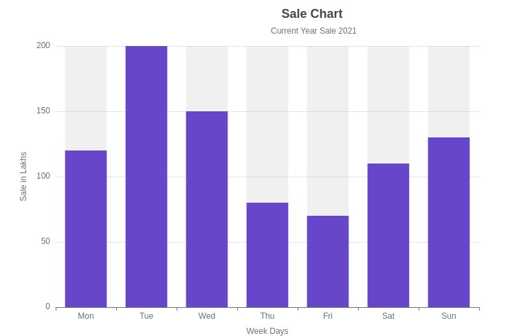
Structure for Series Data :
$.CHART.BAR_CHART[*] = [{
“name” : “Sales Bar”,
“value” : [10,20,30,40,90],
“is_selected” : true
}]
- Pie Chart Component :
A pie chart is a circular statistical graphic, which is divided into slices to illustrate numerical proportion. In a pie chart, the arc length of each slice (and consequently its central angle and area), is proportional to the quantity it represents.
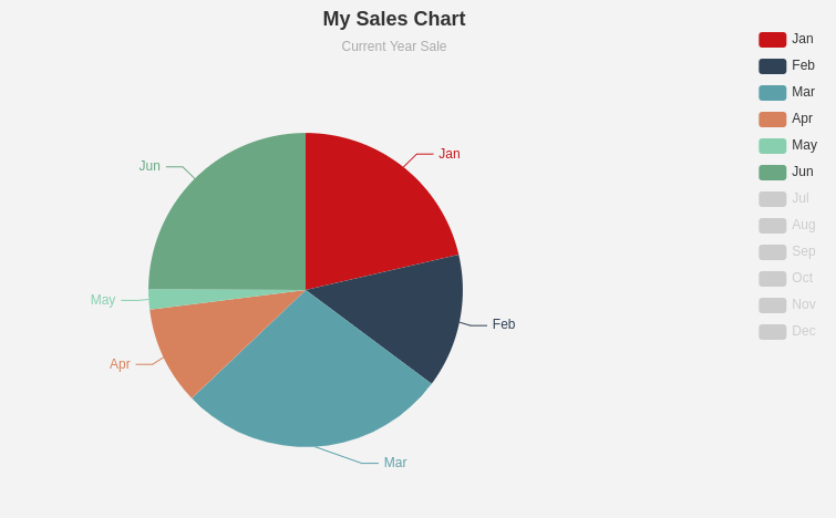
Structure for Series Data :
Field for path : Series data Array
$.CHART.PIE_CHART[*]= [{
“name” : “Jan”,
“value” : 50,
“is_selected” : true
},
{
“name” : “Feb”,
“value” : 40,
“is_selected” : true
},
{
“name” : “Mar”,
“value” : 10,
“is_selected” : true
}]
- Line Chart Component :
A line chart is a type of chart which displays information as a series of data points called
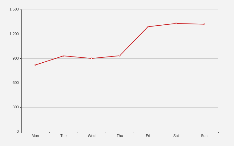
‘markers’ connected by straight line segments.
Structure for Series Data :
Field for path : Series data Array
$.CHART.LINE_CHART[*] = [{
“name” : “line_1”,
“value” : [700,900,910,1300,1400,1370],
“is_selected” : true
}]
- Scatter Chart Component :
A scatter plot is a type of plot or mathematical diagram using Cartesian coordinates to display values for typically two variables for a set of data.
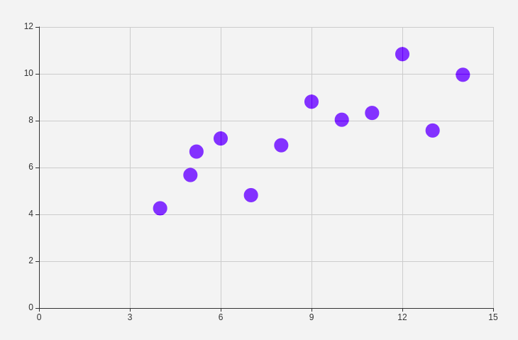
Structure for Series Data :
Field for path : Scatter Series data Array
$.CHART.SCATTER_CHART_DATA = [[2,4],[3,8],[1,9],[6,4],[2,4]].
Thank You
5 Likes
Such a nice explanation Tushar Jain.
2 Likes