What is Card View element and how to use it in vDesigner 1?
2 Likes
Let’s start with the usage of card. In a mobile app, the card has a container. Subsequently, the card container contains multiple card elements that include thumbnail, header, sub heading, media, textual content, image, icon, buttons, and others. The layout of the card is determined on the basis of content, image, or any other data that you want to show on the card.
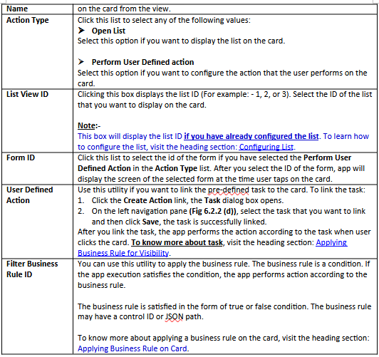
Also, the card may have an actionable feature related to specific topic or utility.
This feature allows you to configure card. To configure the card:
-
In the vDesigner application, locate the left navigation pane.

-
In the left navigation pane, click the Configure Landing Page link the left navigation pane expands.
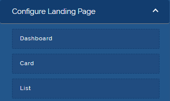
- In the left pane, click the Card link, Card Definition Form opens.
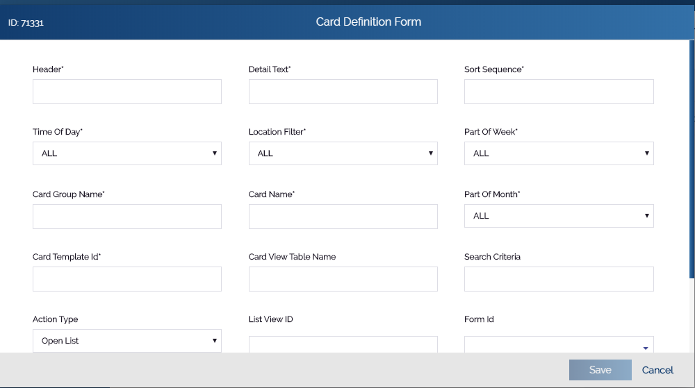
- In Card Definition Form, enter the values in the following boxes as follows:

3 Likes
@tushar.jain Please mark the above as a solution, if that answers your query.
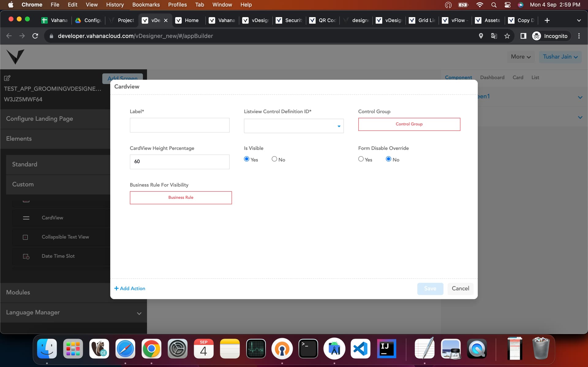
CardView element is created to use a single card in any page without mapping it with a list. By using this any card template can be shown on a page without list.
Below is the reference link on how to use this:
https://drive.google.com/drive/folders/16inoE-dPdjQPyFg3GLuK_7NTsk81PfKC?usp=sharing
2 Likes