Charts are one of the most interesting and powerful elements introduced in VDesigner 2.0.
They help users visualize data in an interactive and meaningful way inside applications built on the Vahana platform.
The following chart types are currently available:
-
Pie Chart
-
Donut Chart
-
Line Chart
-
Area Chart
-
Bar Chart
This document explains how to integrate and configure charts inside your Vahana application.
Prerequisites
Before using charts in your application, you must register the Charts SDK.
Steps to Register the Charts SDK
-
Open your Vahana Application
-
Navigate to the Application Tab
-
Register the Charts SDK
-
Save the configuration
Once the SDK is registered successfully, chart components will become available in the designer panel.
Adding Charts to Canvas
Step 1: Drag and Drop the Chart
From the available chart components, drag the required chart onto the canvas.
Available charts:
-
Pie
-
Donut
-
Line
-
Area
-
Bar
Step 2: Change Reference Name
After dropping the chart:
-
Select the chart component
-
Update the Reference Name according to your convenience and naming standards
Example:
-
pieChartSales -
monthlyBarChart -
quarterAreaChart
Step 3: Configure Input Source
Go to:
Input Source
You can configure data using:
-
Static Input Source
-
Data Source
Static Input Data Format
The chart data must be provided in JSON format.
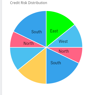
Pie Chart Configuration
Sample Data
[
  {
    "label": "North",
    "data": 40,
    "backgroundColor": "#FF6384"
  },
  {
    "label": "South",
    "data": 25,
    "backgroundColor": "#36A2EB"
  },
  {
    "label": "East",
    "data": 20,
    "backgroundColor": "#FFCE56"
  },
  {
    "label": "West",
    "data": 15,
    "backgroundColor": "#4BC0F0"
  }
]
Description
| Property | Description |
|---|---|
| label | Name of the data section |
| data | Numeric value |
| backgroundColor | Color of the chart segment |
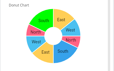
Donut Chart Configuration
Sample Data
[
  {
    "label": "North",
    "data": 10,
    "backgroundColor": "#FF6384",
    "hoverBackgroundColor": "#00FF00"
  },
  {
    "label": "South",
    "data": 25,
    "backgroundColor": "#36A2EB",
    "hoverBackgroundColor": "#00FF00"
  },
  {
    "label": "East",
    "data": 20,
    "backgroundColor": "#FFCE56",
    "hoverBackgroundColor": "#00FF00"
  },
  {
    "label": "West",
    "data": 15,
    "backgroundColor": "#4BC0F0",
    "hoverBackgroundColor": "#00FF00"
  }
]
Description
| Property | Description |
|---|---|
| label | Segment label |
| data | Numeric value |
| backgroundColor | Default color |
| hoverBackgroundColor | Color displayed on hover |
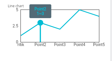
Line Chart Configuration
Sample Data
[
  {
    "label": "Point1",
    "x": 0,
    "y": 1
  },
  {
    "label": "Point2",
    "x": 1,
    "y": 3
  },
  {
    "label": "Point3",
    "x": 2,
    "y": 2
  },
  {
    "label": "Point4",
    "x": 3,
    "y": 5
  },
  {
    "label": "Point5",
    "x": 4,
    "y": 4
  }
]
Description
| Property | Description |
|---|---|
| label | Data point label |
| x | X-axis value |
| y | Y-axis value |
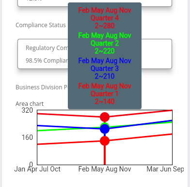
Area Chart Configuration
Sample Data
[
  {
    "borderColor": "#ff0000",
    "label": "Quarter 1",
    "data": [
      {
        "childLabel": "Jan",
        "x": 1,
        "y": 120
      },
      {
        "childLabel": "Feb",
        "x": 2,
        "y": 140
      },
      {
        "childLabel": "Mar",
        "x": 3,
        "y": 180
      }
    ]
  },
  {
    "borderColor": "#00ff00",
    "label": "Quarter 2",
    "data": [
      {
        "childLabel": "Apr",
        "x": 1,
        "y": 200
      },
      {
        "childLabel": "May",
        "x": 2,
        "y": 220
      },
      {
        "childLabel": "Jun",
        "x": 3,
        "y": 250
      }
    ]
  }
]
Description
| Property | Description |
|---|---|
| borderColor | Line/area border color |
| label | Dataset label |
| childLabel | Child data label |
| x | X-axis value |
| y | Y-axis value |
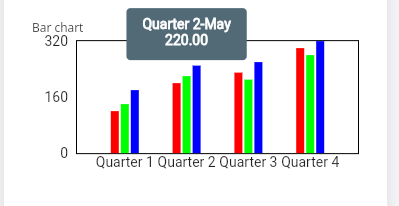
Bar Chart Configuration
Sample Data
[
  {
    "label": "Quarter 1",
    "data": [
      {
        "childLabel": "Jan",
        "backgroundColor": "#ff0000",
        "value": 120
      },
      {
        "childLabel": "Feb",
        "backgroundColor": "#00ff00",
        "value": 140
      },
      {
        "childLabel": "Mar",
        "backgroundColor": "#0000ff",
        "value": 180
      }
    ]
  },
  {
    "label": "Quarter 2",
    "data": [
      {
        "childLabel": "Apr",
        "backgroundColor": "#ff0000",
        "value": 200
      },
      {
        "childLabel": "May",
        "backgroundColor": "#00ff00",
        "value": 220
      },
      {
        "childLabel": "Jun",
        "backgroundColor": "#0000ff",
        "value": 250
      }
    ]
  }
]
Description
| Property | Description |
|---|---|
| label | Group label |
| childLabel | Individual bar label |
| backgroundColor | Bar color |
| value | Bar value |
Additional Configuration
After adding the chart data:
-
Configure alignment as required
-
Configure spacing and padding
-
Adjust dimensions according to screen layout
-
Customize colors for better visualization
Best Practices
Keep colors consistent
Avoid excessive data points in Pie/Donut charts
Use Line and Area charts for trends
Use Bar charts for comparisons
Validate JSON format before saving
Conclusion
Charts in VDesigner 2.0 provide a powerful and interactive way to visualize data inside Vahana applications.
By registering the Charts SDK and configuring the required JSON data structure, you can quickly integrate visually rich analytics into your applications using:
Pie Charts
Donut Charts
Line Charts
Area Charts
Bar Charts
These components are fully configurable and can be aligned according to your business requirements and UI design preferences.